strategy
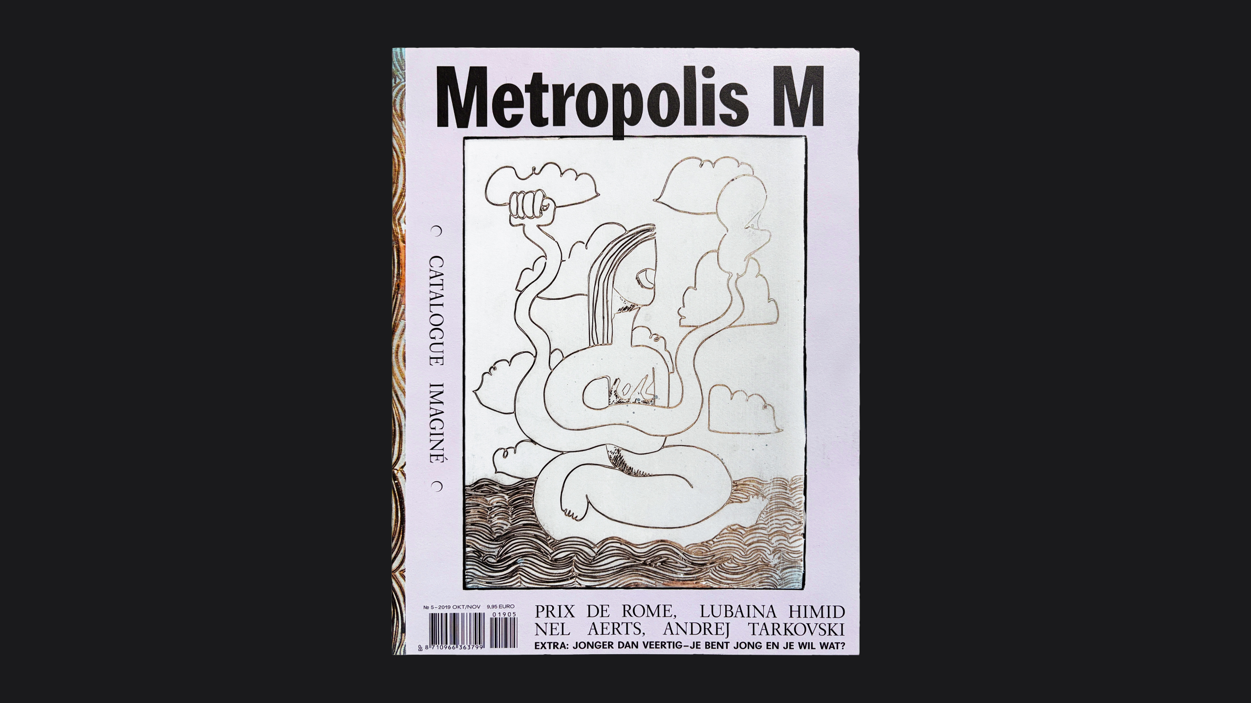
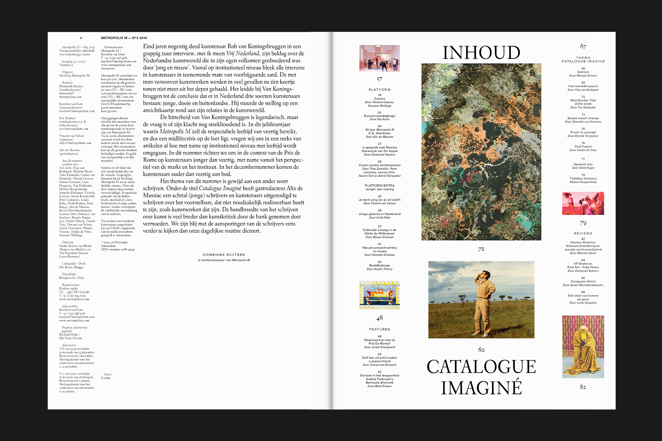
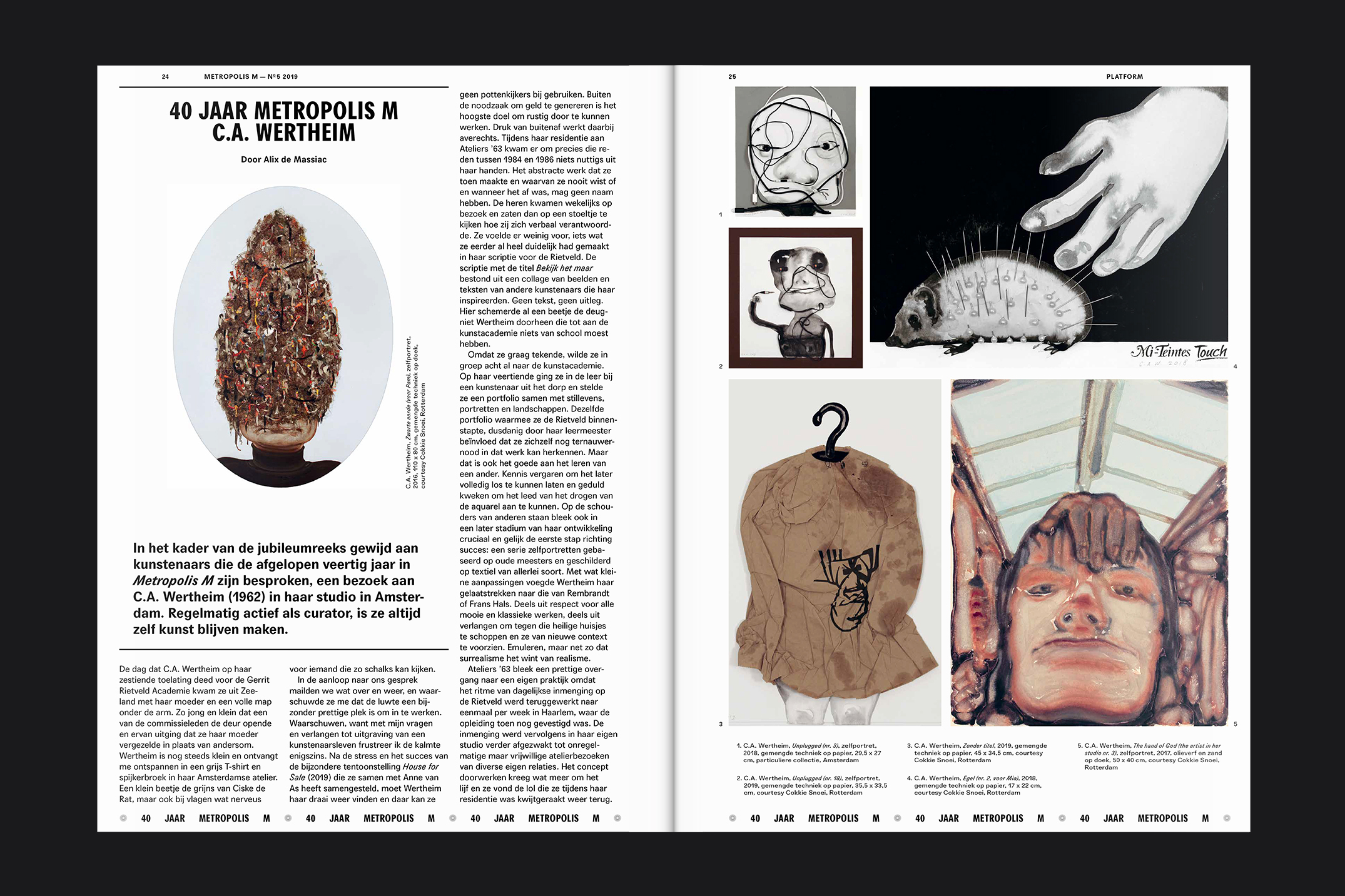
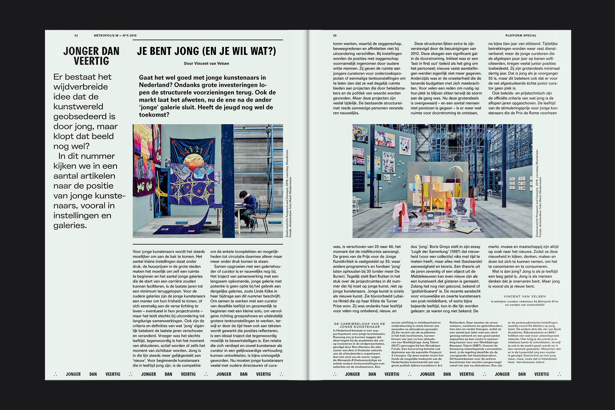
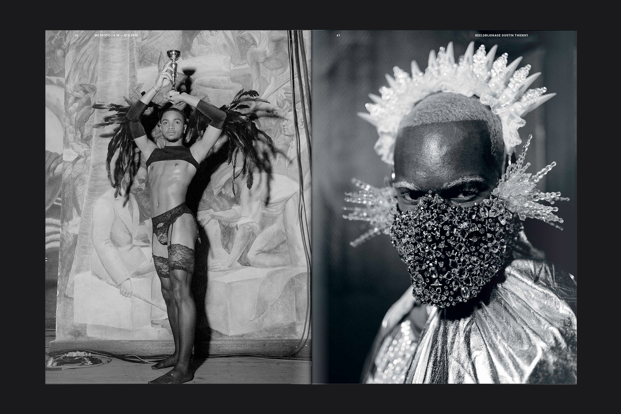
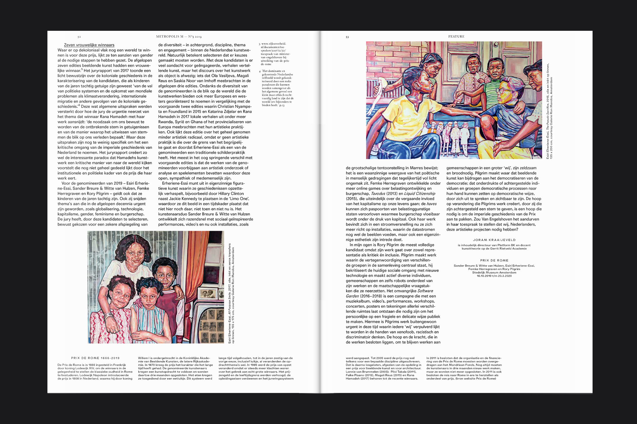
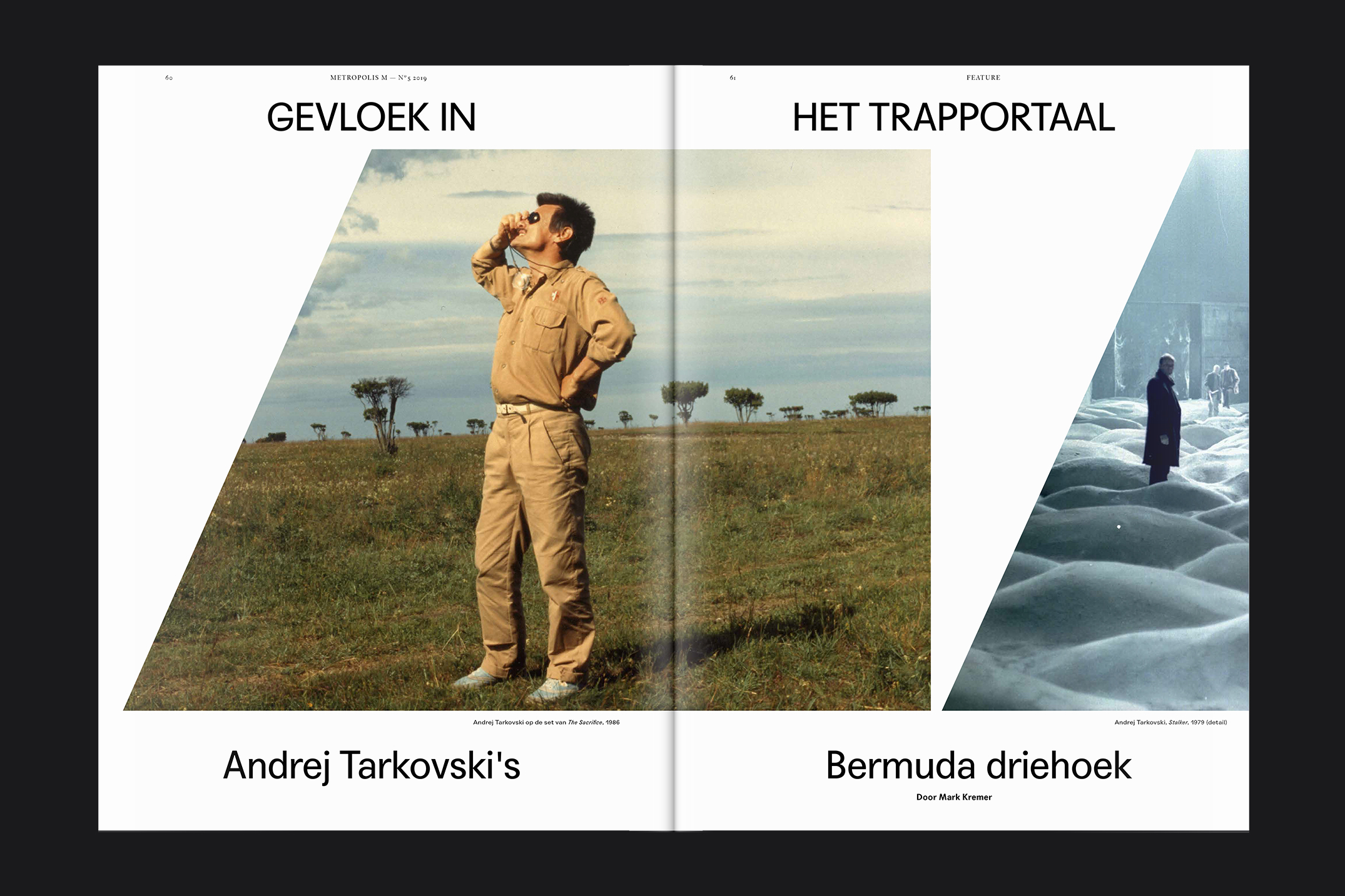
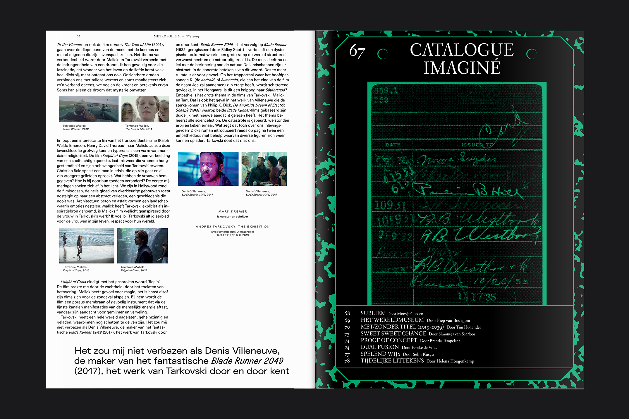
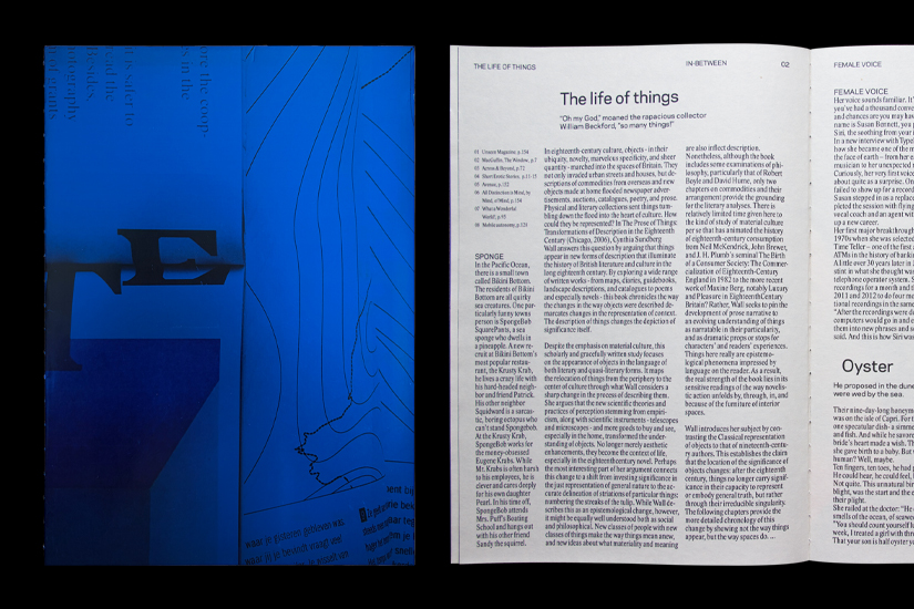
The biggest challenge of designing an art magazine is that the content, the artworks themselves, provides no visual consistency. Every artwork is different, and no two spreads share the same visual character. The consistency had to come entirely from the design: a flexible editorial grid and a clear set of typographic rules that could hold together a wide variety of work without overshadowing any of it.
design
The existing grid system allowed a wide range of layouts, particularly on the larger cover pages where there was significant creative freedom. Typography was kept modest and minimal throughout, always in service of the art. Wherever possible, the placement of text responded directly to the artworks on the page, creating a dialogue between the editorial design and the work being presented.